Financial & Usage Trends
Visualize your revenue streams and client usage patterns over time with interactive charts and graphs.
Understand the "why" behind your numbers with detailed trend analysis.
Visual Charts and Graphs:
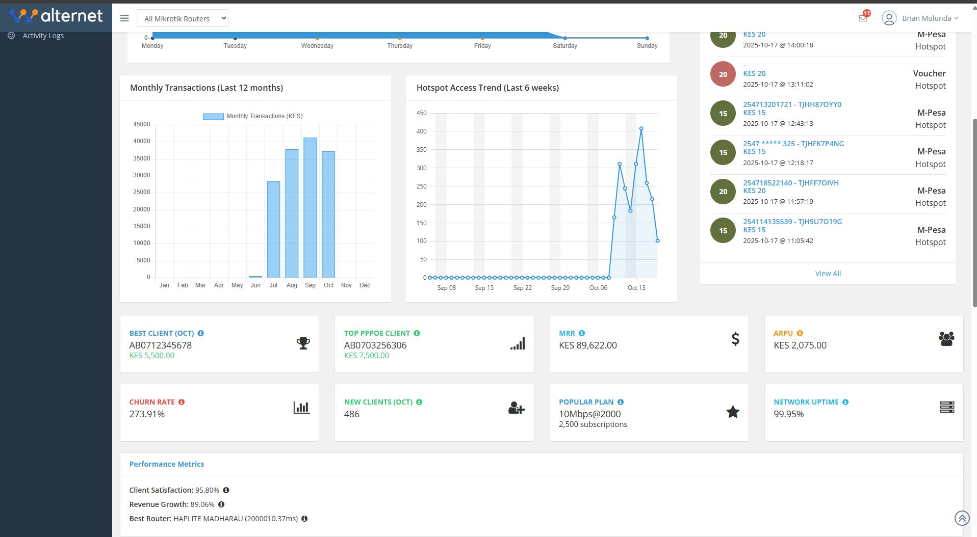
Monthly Transactions (Last 12 months): A line or bar graph showing revenue trends over the past year, helping identify seasonal patterns and growth trajectories.
Revenue By Plan: A breakdown of how much revenue each service plan generated in a given period (e.g., October 2025). This shows which plans are the most profitable, not just the most popular.
Hotspot Access Trend (Last 6 weeks): A graph showing the number of logins or active sessions on your hotspot network. This is ideal for understanding daily and weekly usage cycles and peak demand times.
These visualizations make it easy to spot correlations, such as how a marketing campaign affected revenue or how usage changes on weekends.
Screenshots